I love loft app
scope of work: Creative Direction | UX / UI Design | design system
technology: figma | photoshop | illustrator
launch of the roc design series
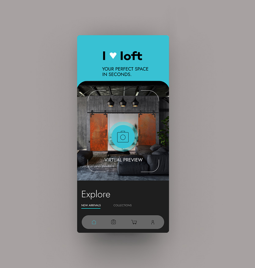
Since the launch of the unique ROC DESIGN loft system series in 2018, I proposed an overall design enhancement after a few years. This also led to revisiting the initial idea of developing a mobile app that provides a unique platform for searching and purchasing the most sought-after door system designs. A key concept behind the app, the 'Virtual Preview’, was to enable users to take a sample of their interior and, in real-time, find the product that best suited their space.
project overview
Offering a diverse and unique selection, I LOVE LOFT inspires users with loft interior ideas while simplifying the journey from browsing to buying. Whether you’re a professional designer or a design enthusiast, the app provides tailored solutions for your loft space. From AR-powered visualizations to a curated style guide, ROC DESIGN delights with inventive and sophisticated tools that meet the highest quality expectations. Intuitive, stylish, and functional – your ideal loft interior is just a tap away.
workflow: Defining the Problem
Core Challenge:
- Difficulty finding a visually engaging and comprehensive platform for product discovery.
- Limited knowledge on how these fittings complement loft-style interiors.
- Frustrations with non-intuitive or overly complex online shopping platforms.
User Pain Points:
- Lack of inspiration for incorporating fittings into personalized designs.
- Inability to visualize products in their own spaces.
- Difficulty in filtering or customizing products to match specific needs.
project goals
Primary Objective:
To create an app that simplifies the discovery, education, and purchasing process for loft door fittings, while inspiring users with curated design ideas.
Secondary Objective:
- Develop a visually striking and intuitive interface.
- Provide educational content to guide users on loft interior design.
- Include customization options for fittings (size, finish, material).
- Cater to design-savvy, quality-conscious users.
Research & Insights
User Research:
- Conducted interviews with interior designers, loft apartment owners, and home improvement enthusiasts.
- I used surveys to gauge user expectations for product variety, customization, and usability.
Competitive Analysis:
- Examined apps like Houzz or Pinterest for inspiration and identify gaps in product-focused solutions.
- Studied e-commerce platforms to understand best practices for product visualization and customization.
Product Insights:
- It’s crucial to work closely with the product team to highlight key differentiators, such as unique materials, craftsmanship, and installation options.
Design Workflow
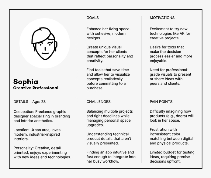
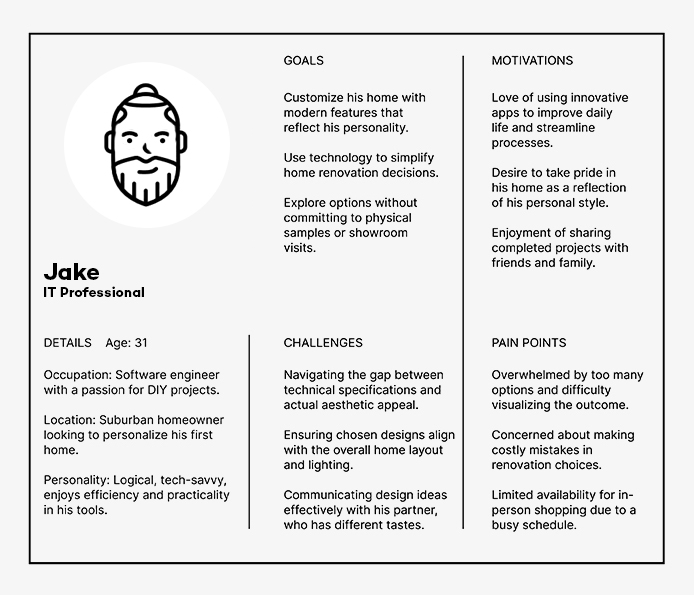
user personas
Here are Sophia and Jake, including their goals, pain points, challenges, and motivations, tailored for their roles as potential users of the I Love Loft App:
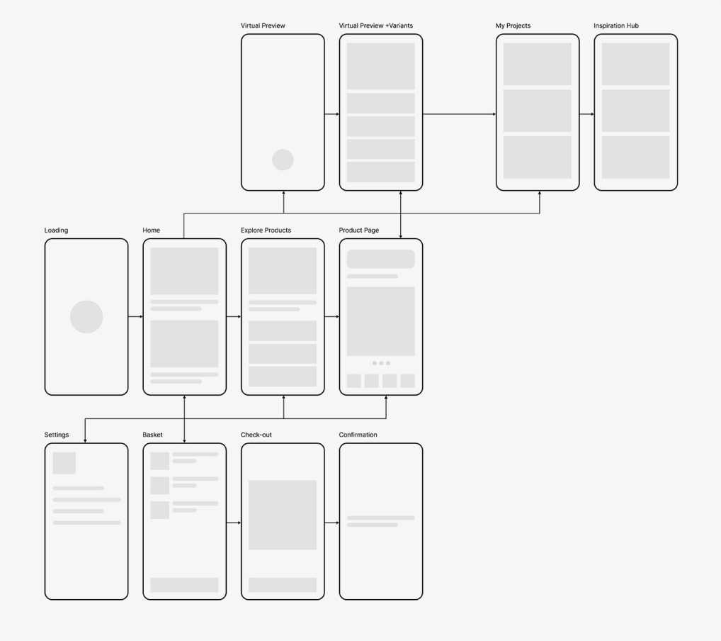
user journey
Defined Customer Journey for the I Love Loft App, emphasizing the Virtual Preview feature as a core element to engage users early in their exploration process:
- Loading → Home → Try Virtual Preview → View Product Page → Basket
- Alternate: Loading → Home → Explore Product Collection → Select Product → Virtual Preview (Optional) → Basket
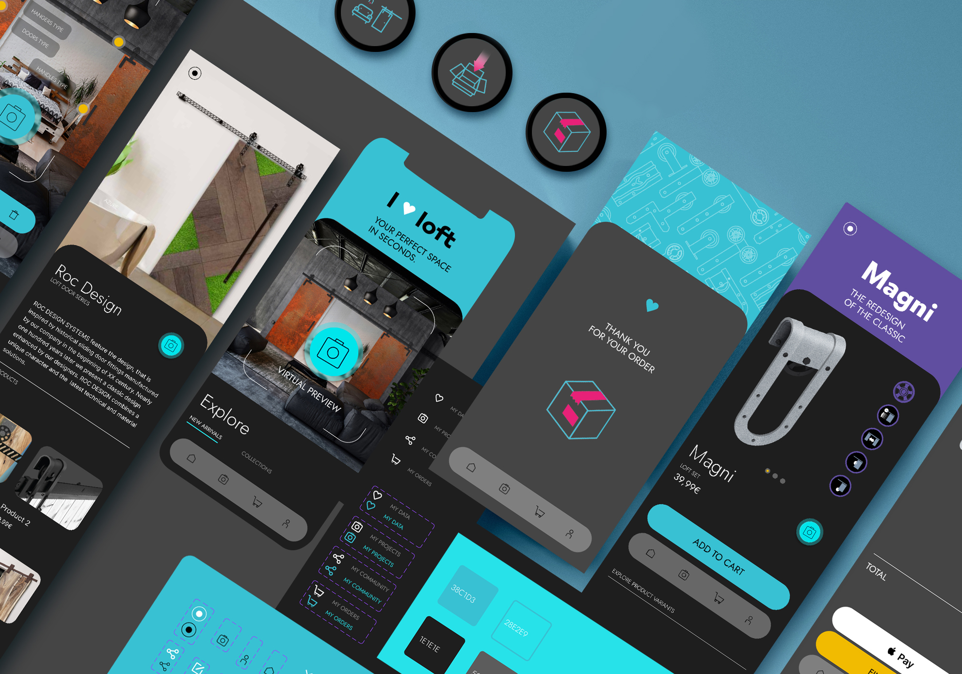
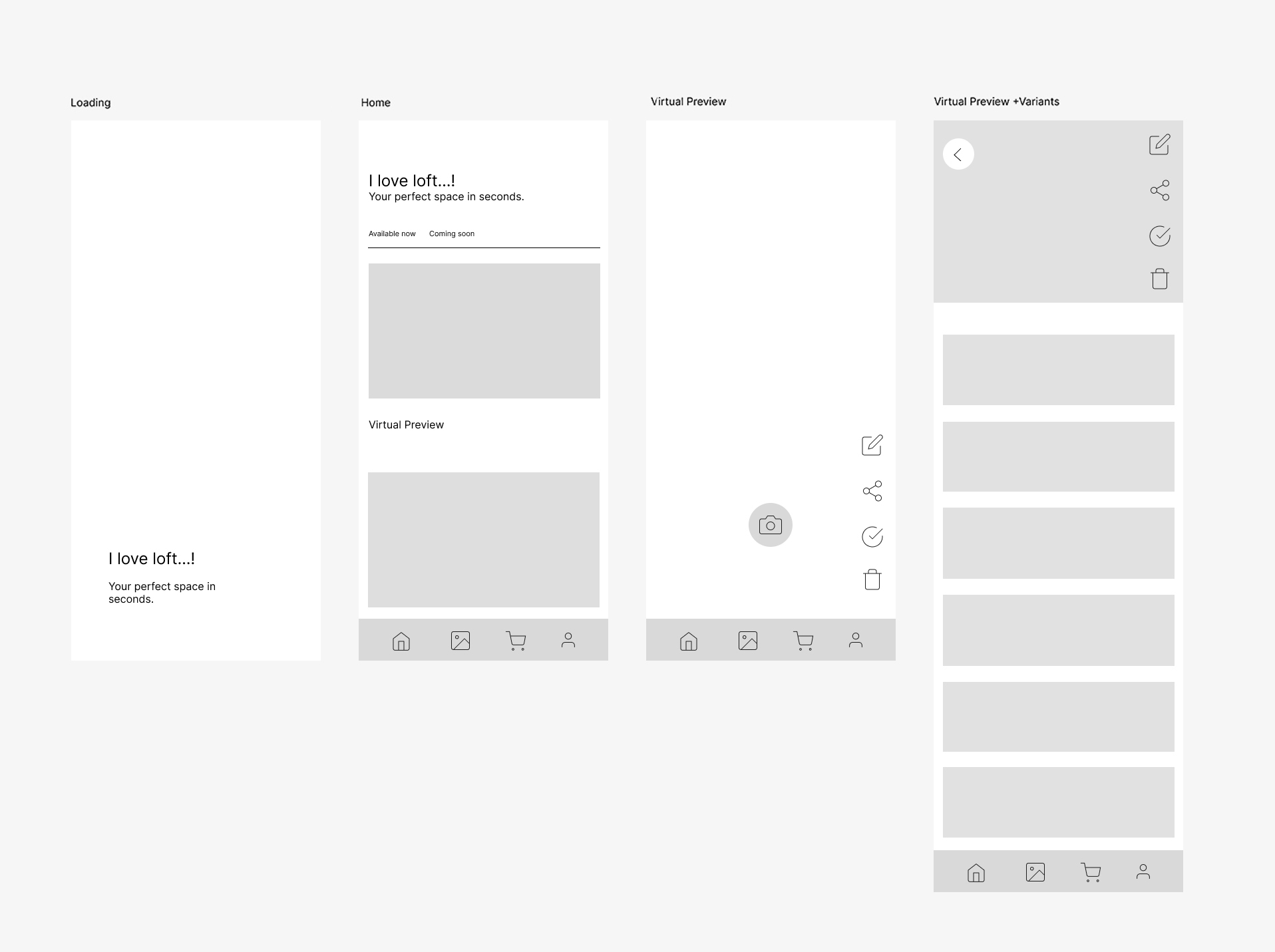
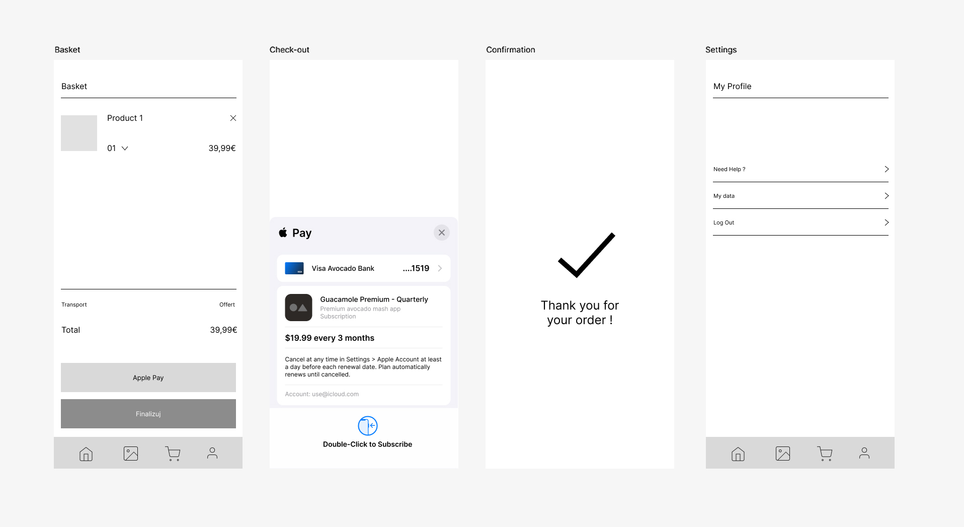
Wireframing & Prototyping
I created low-fidelity wireframes featuring crucial parts of the App: ,
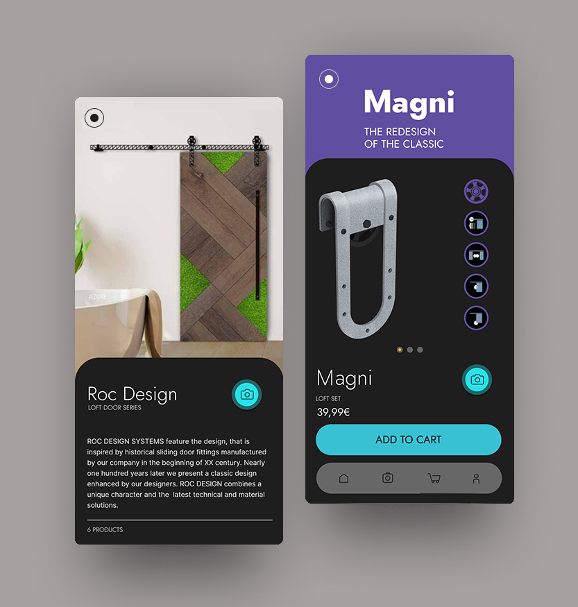
- Loading screen and Homepage, with direct link to main feature – Virtual Preview + Collection overview
- Basic screen of Virtual Preview + the screen with the possibility of adding chosing scecific product variant for visualisation
- My Project Section, which would allow to store chosen design views
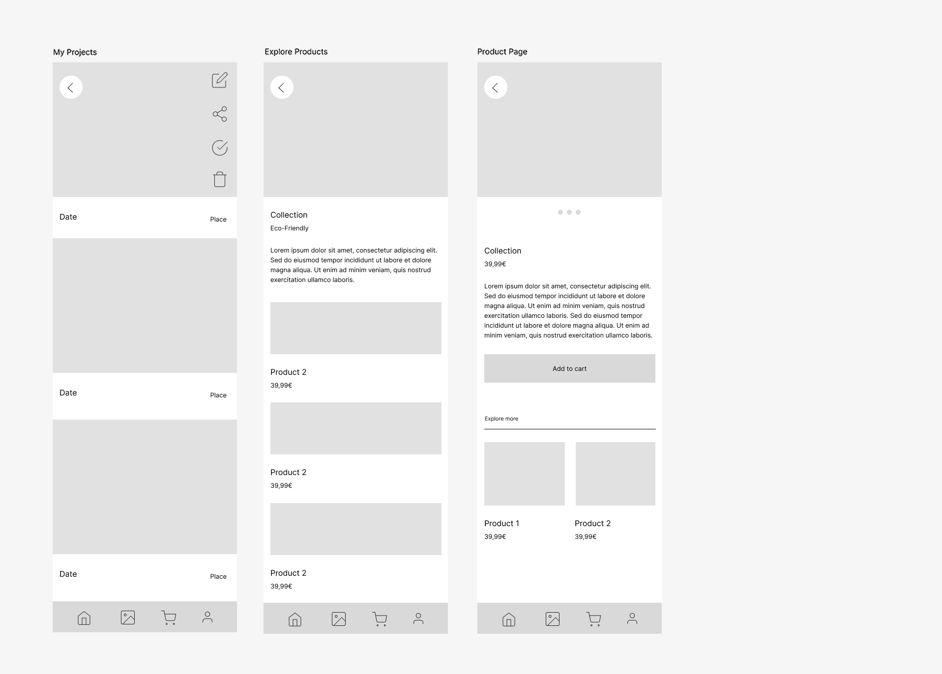
- The Basket / Checkout Process pages focused on clarity and simplicity
- Settings Page which would store all data valuable for the user, including shopping lists, saved projects, community hub, etc.
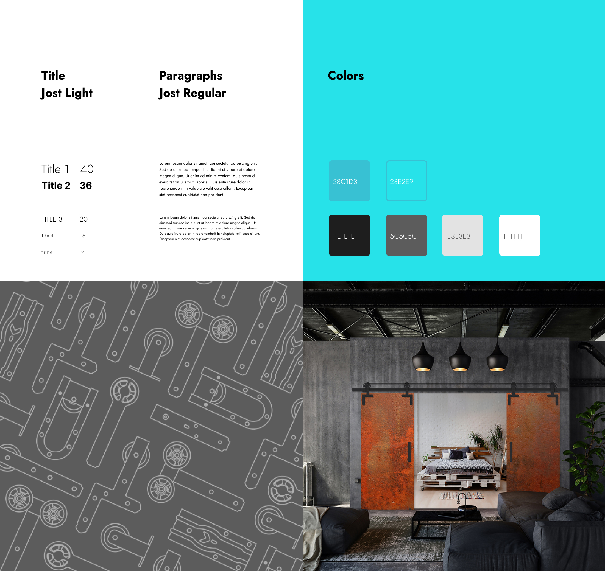
visual design : color scheme
My base was on the product colors that i defined earlier in the product developement stage. All the products from the ROC DESIGN famili had it’s distinctive colors defined:
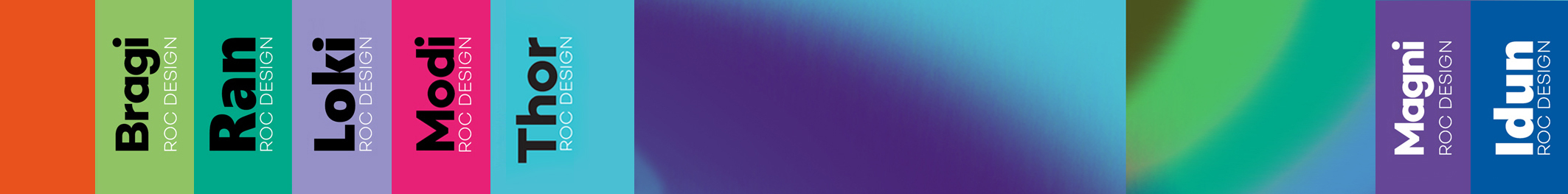
For the core APP color I chose a grayish blue color, which corresponds with the main product of this series (THOR). I paired this shade with slightly accentuated light, and then coupled the pair with three neutral gray shades and white which presented clear yet strong characteristic: